1 行内元素的水平垂直居中
1.1 单行文本
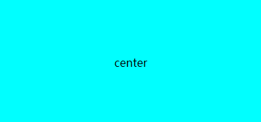
要实现行内元素的水平居中,只需把行内元素包裹在块级父层元素中,并且在父层元素CSS设置如下:
1
2
3
| <div class="box">
<p>center</p>
</div>
|
1
2
3
4
5
6
7
| .box{
background-color: aqua;
width: 400px;
height: 200px;
text-align:center;
line-height: 200px;
}
|
简单但是有缺点:只适应单行文本
如果有多行文本,无法水平垂直居中
1.2 多行文本
flex布局
多行文本,使用flex布局,设置主轴和交叉轴的对齐方式就可以了
1
2
3
| <div class="container">
<p>center555 okkk breakall alllbrake someyook oolmols looltheboy intergefer asda </p>
</div>
|
1
2
3
4
5
6
7
8
9
| .container{
background-color: aqua;
width: 400px;
height: 200px;
word-break: break-all;
display: flex;
align-items:center;
justify-content: center;
}
|
grid布局
也可以使用grid布局,设置单元格内容的 水平垂直位置
1
2
3
| <div class="container">
<p>center555 okkk breakall alllbrake someyook oolmols looltheboy intergefer asda </p>
</div>
|
1
2
3
4
5
6
7
8
9
10
11
| .container {
background-color: aqua;
width: 400px;
height: 200px;
word-break: break-all;
display: grid;
}
p {
justify-self: center;
align-self:center
}
|
2 块级元素
2.1 块状元素水平居中
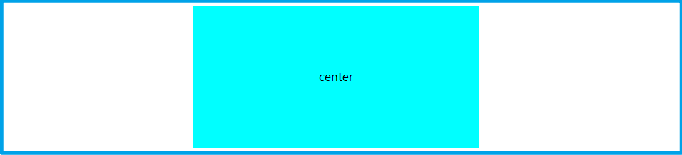
要实现块状元素(display:block)的水平居中,我们只需要将它的左右外边距 margin-left 和 margin-right 设置为 auto,即可实现块状元素的居中
1
2
| <div class="container">
</div>
|
1
2
3
4
5
6
| .container{
background-color: aqua;
width: 400px;
height: 200px;
margin:0 auto;
}
|
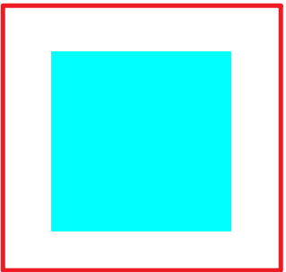
2.2 块状元素水平垂直居中
1
2
| <div class="container" style="background-color: aqua; width: 200px; height: 200px;">
</div>
|
1
2
3
4
5
6
| .container{
position: absolute;
top: 50%;
left: 50%;
transform: translate(-50%, -50%);
}
|
css前3行代码,使得元素的左上角点位于水平垂直居中
translate() 这个 CSS 函数在水平和/或垂直方向上重新定位元素,移动元素的宽高的一半
使得整个元素水平垂直居中
利用绝对定位与margin
1
2
| <div class="container" style="background-color: aqua; width: 200px; height: 200px;">
</div>
|
1
2
3
4
5
6
7
8
| .container{
position:absolute;
margin:auto;
top:0;
bottom:0;
left:0;
right:0;
}
|
2.3 多个块状元素的水平垂直居中
flex布局:
使用flex布局,定义项目在主轴/交叉轴上的对齐方式
使用flex布局,无需绝对定位等改变布局的操作,可以轻松实现元素的水平垂直居中
1
2
3
4
5
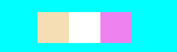
| <div class="container" style="background-color: aqua; width: 1400px; height: 200px;">
<div style="background-color: wheat; height: 100px; width: 100px;"></div>
<div style="background-color: white; height: 100px; width: 100px;"></div>
<div style="background-color: violet; height: 100px; width: 100px;"></div>
</div>
|
1
2
3
4
5
| .container {
display: flex;
justify-content: center;
align-items: center;
}
|
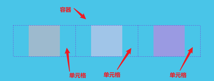
grid布局:
容器设置为grid布局后,
1
2
3
4
5
| <div class="container" style="background-color: aqua; width: 1400px; height: 500px;">
<div class="box" style="background-color: wheat; height: 100px; width: 100px;"></div>
<div class="box" style="background-color: white; height: 100px; width: 100px;"></div>
<div class="box" style="background-color: violet; height: 100px; width: 100px;"></div>
</div>
|
1
2
3
4
5
6
7
8
9
10
11
12
13
14
15
16
| .container{
display: grid;
grid-template-columns: 200px 200px 200px;
justify-content: center;
align-content: center;
justify-items: center;
align-items: center;
}
.box{
}
|